Layouts
Galleries can be displayed in different Layouts. Layout can be set in default Component Options or individually for each Gallery in Gallery Settings. Also Module or Menu Item have their Layout Settings.
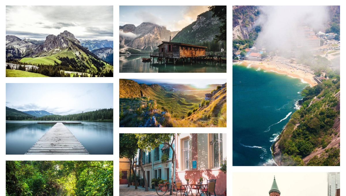
Masonry Layout
Masonry is a grid layout based on columns. Custom Thumbnails are used and placed into the vertically aligned collumns filled with defined spaces.Masonry layout is also referred to as the Pinterest Style Layout, as it was the first major website to use this layout style.
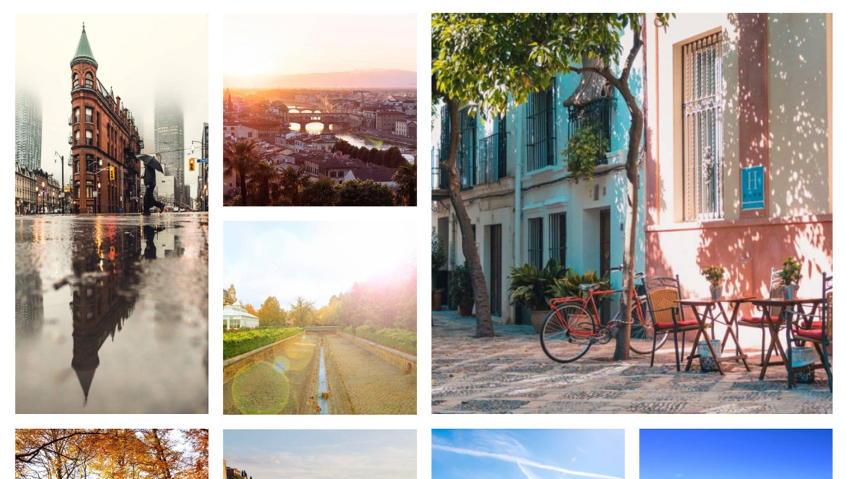
Metro Layout
Metro Layout is another variation of Grid Layout. Unlike Masonry Layout, Metro uses strictly defined Grid of 1x1Square, 2x2 Square, 2x1 Portrait and 1:2 Landscape versions of Thumbnails to set the perfect geometry of the Grid Layout.
Tile Layout
Tile Layout uses 1x1 Square and 2:1 Portrait Thumbnails to fit the Grid geometry Vertically and Horizontally.
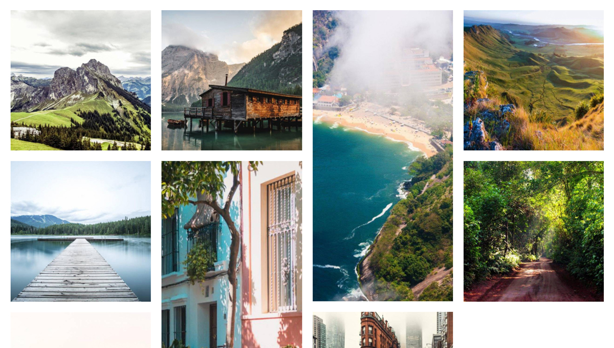
Justified Layout
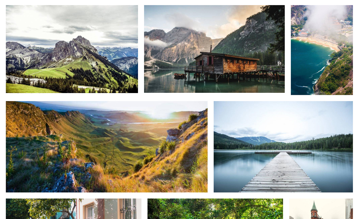
Justified Layout uses Custom Thumbnails to set the Horizontally oriented Grid.
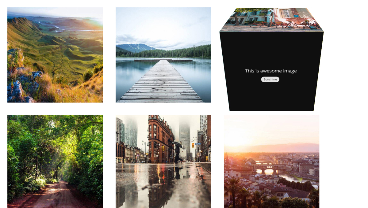
Grid3D Card Layout
Grid3D Card Layout uses Square thumbnails to display square grid of cards with 3D hover effect.
Grid3D Cube Layout
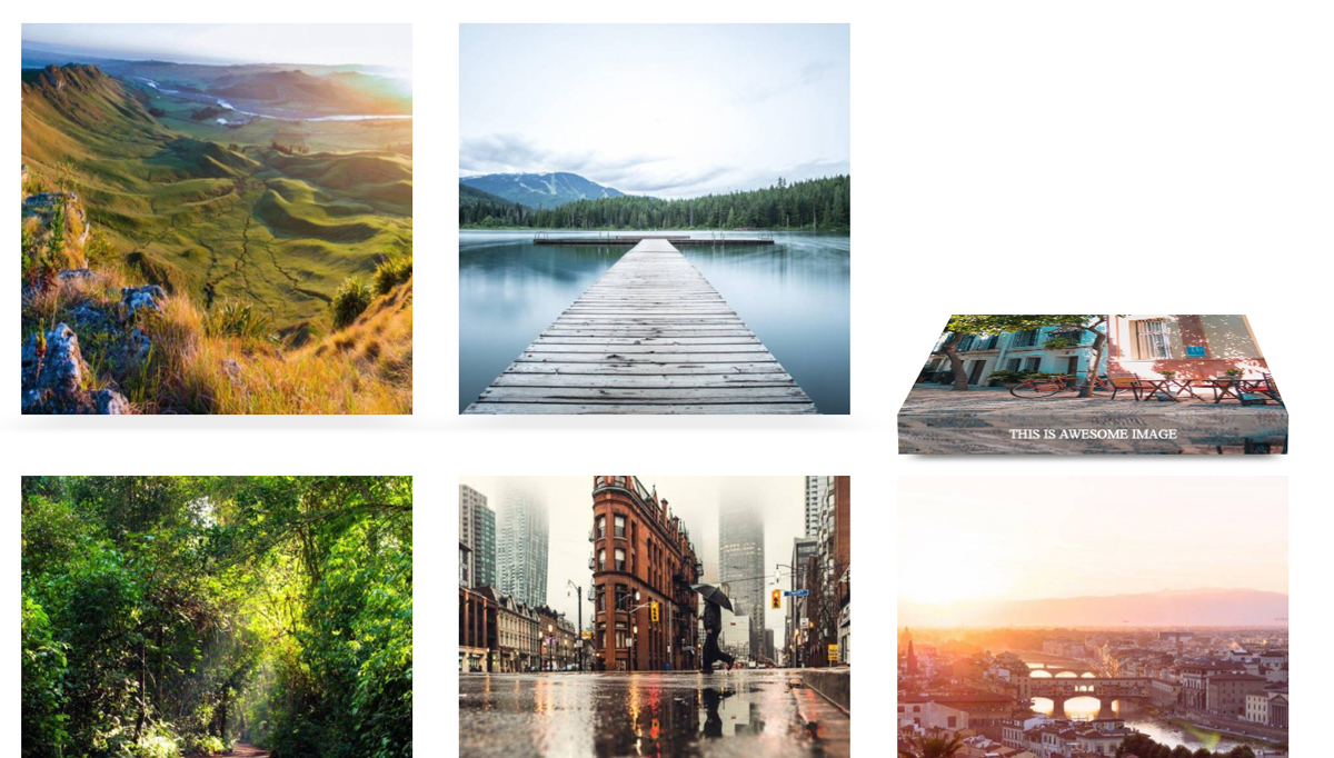
Grid3D Cube Layout uses Square thumbnails to display square grid of cubes with 3D hover effect.
